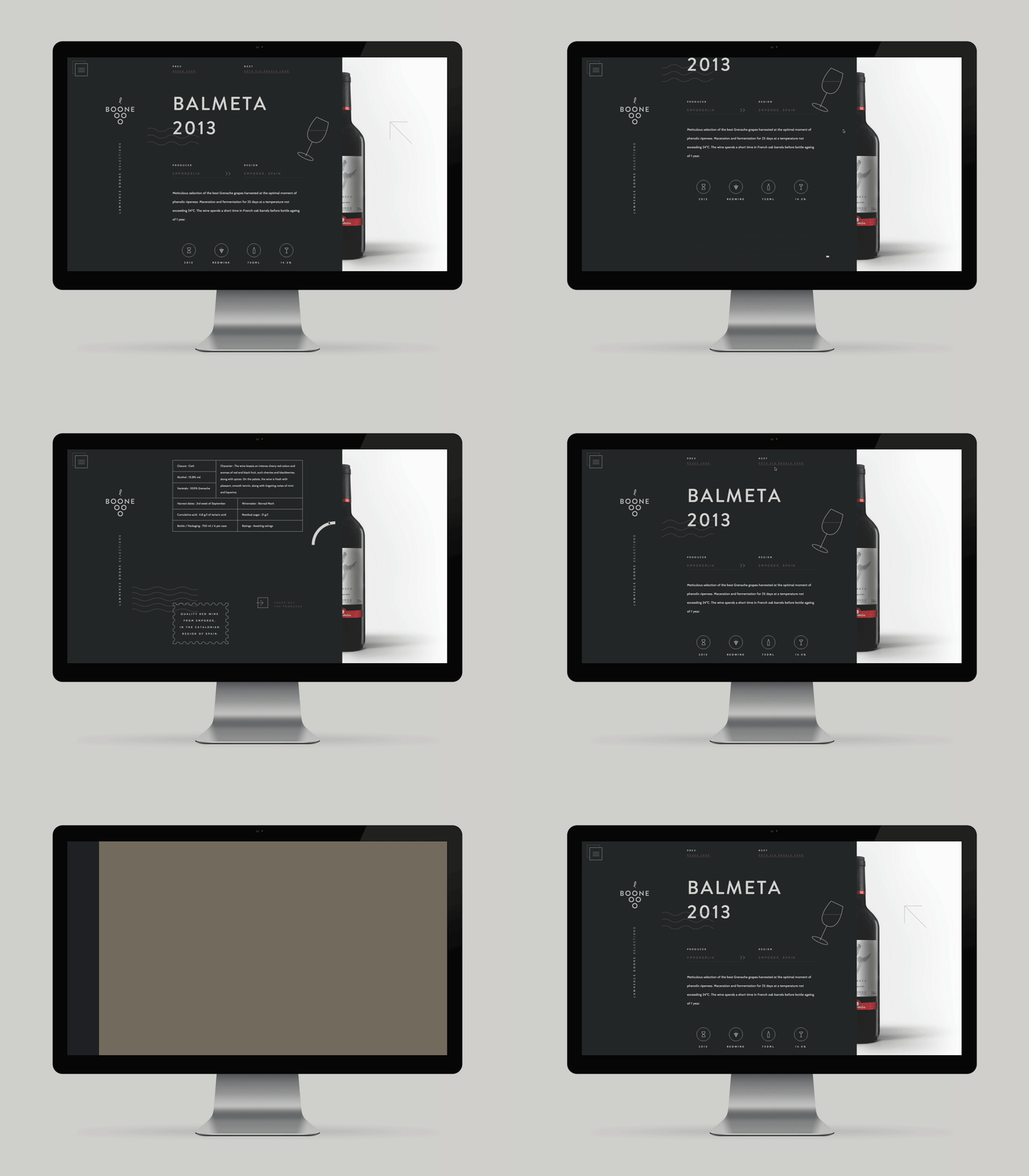
In today's digital landscape, where users access websites on many devices, having a Responsive Website Designing solution has become paramount. A responsive website seamlessly adapts its layout, content and functionality to provide an optimal viewing experience across various screen sizes, from desktop monitors to smartphones and tablets.
Gone are the days when a one-size-fits-all approach to website design sufficed. With the growing use of smartphones and tablets, a responsive website helps maintain its visual appeal and usability across devices, supporting user engagement and a consistent brand experience.
A responsive website design helps create a consistent experience irrespective of the device being used. Images, text and navigation menus can adjust to fit different screens, reducing the need for excessive zooming or horizontal scrolling.
This smooth navigation encourages visitors to explore your website, discover your products or services and interact with your business. Whether users are at their desks or browsing on the go, a responsive layout helps make your website more convenient to use.
Our Responsive Website Designing Company in Delhi keyword links to the relevant service page.
A good responsive website combines flexible layouts, readable content and easy navigation to provide a practical browsing experience on different devices.
Page layouts adjust to different viewport widths to keep content organized and easy to read.
Images resize appropriately for different screens, helping prevent overflow and layout problems.
Clear menus and accessible navigation help visitors find information without unnecessary effort.
Readable text and touch-friendly controls make the website easier to use on smartphones.
Efficient code and optimized media can help improve loading performance across devices.
Consistent colours, typography and content help maintain your brand identity across platforms.
Search engines use mobile-first indexing for most websites, making mobile-friendly content and accessibility important considerations. A responsive website also gives businesses one main website experience to maintain instead of separate desktop and mobile versions.
A consistent design can help businesses manage their content more efficiently while providing visitors with a familiar experience on different devices.
As technology evolves, new devices with varying screen sizes continue to emerge. Responsive website design helps your online presence adapt to different viewport sizes without requiring a separate website for every device.
A flexible layout, maintainable code and consistent content make it easier to support a broad range of devices as your business website evolves.
Responsive design supports a consistent website experience while allowing layouts to adapt to changing screen dimensions.
A responsive website is an important part of today's digital presence. By combining usability, accessible content and adaptable layouts, your website can provide a more consistent experience across desktops, tablets and mobile devices.
Explore our Responsive Website Designing Services in India to learn more about responsive website solutions.
A responsive website helps present your business consistently across smartphones, tablets and desktops. Flexible layouts, clear navigation and optimized images make it easier for visitors to browse your content and discover your services.
© 2026 Webnex India. Best Website Designing Company in Delhi